Colour and shape theory
In the lecture, we looked at famous video game characters and their shape and colour.
Creating Top-down shooter assets
In this workshop, the task we got was to make assets for a top-down shooter game including the player, an enemy, and the bullet.
I came up with a silly idea of making the player shoot zombie monkeys with bananas and got to drawing. I first started by making a photoshop document, I made three artboards all 64 x 64 pixels.
Sprites
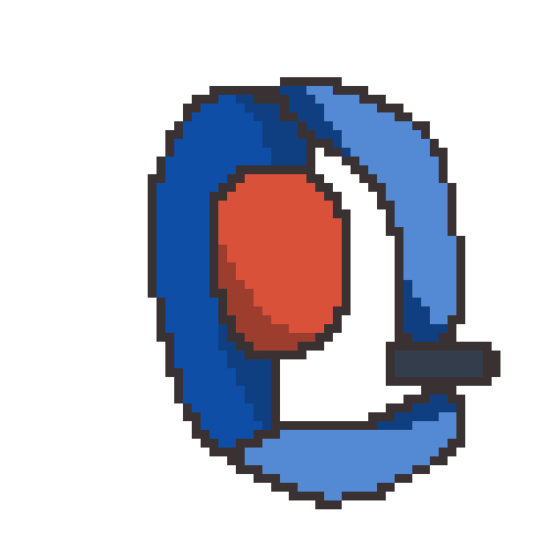
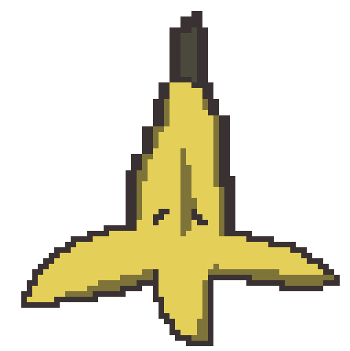
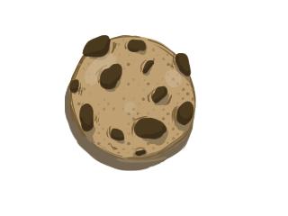
These are the three sprites I made in photoshop.
The player sprite was made so that it had both round and some square features, I didn’t really have a solid idea for this sprite so I ended up just making a general-looking top-down shooter sprite with bright red as the head to easily distinguish which is the player.
The enemy sprite I feel could have had more shape to it, from what I learned in the lecture evil characters usually have more pointy shapes but I wanted to make a sprite that looked like a zombie monkey which I feel has been achieved. I did colour this darker than the player to give a contrast between good and bad characters.
For the bullet sprite I kept with the character’s bright theme and made it yellow, I feel like this is the best sprite out of the three as it has the most depth and good shading for the shadows.
What was challenging?
I feel like one thing that was challenging for this task was mostly sticking to the theme and making the characters look like they are bad or good. I feel like there is a lot I could have improved on for both the player and the monkey, for the player I feel like I should have taken my time when drawing because I wasn’t very happy with how the body proportions turned out. For the monkey I think that this character can look good if there wasn’t much of a contrast between the player colours, what I would change about it is the shape and maybe make it a bit more pointy.
Leave a Reply